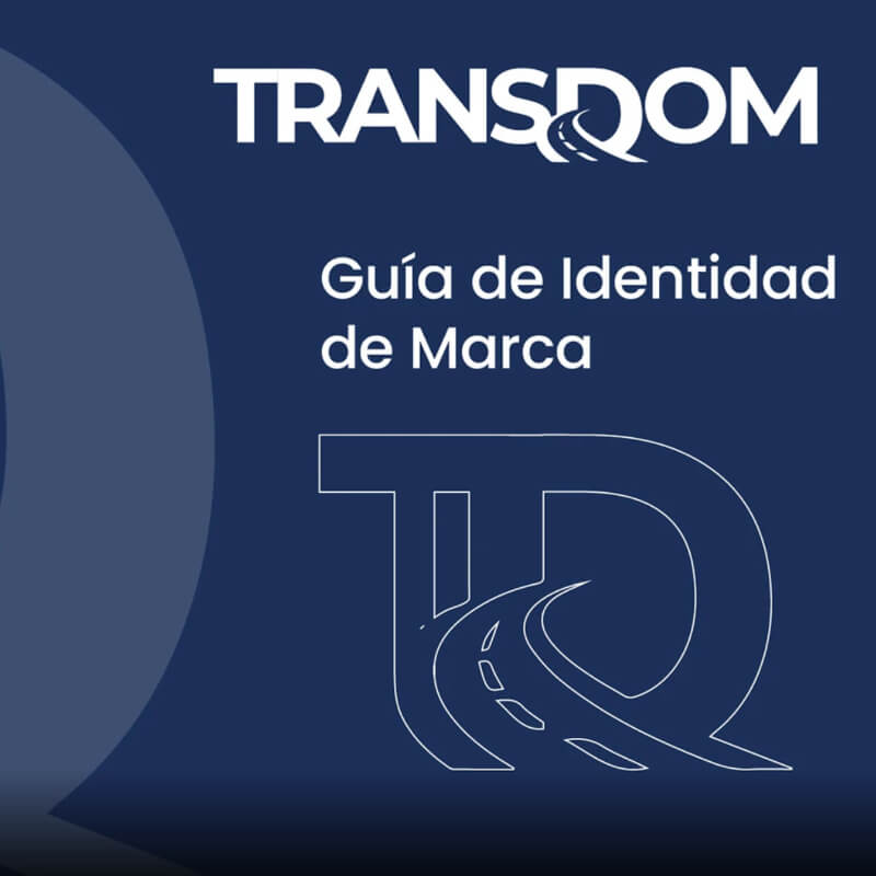
Transdom — Identity system for a Dominican transportation company
Design of a complete corporate identity system for Transdom, a transportation company in the Dominican Republic. From the brand concept to its application on the vehicle fleet, uniforms, and institutional documentation.
↗ View full project on BehanceThe problem: no identity to represent them on the road
Transdom operated without a consistent visual identity system. In the Dominican transportation sector, the brand physically travels on every vehicle — with no identity, there's no differentiation on the road, no perception of professionalism, and no accumulated brand recognition.
- No official logo or vector version
- Vehicles with no consistent corporate signage
- Generic printed materials with no identity
- Uniforms with no visible branding
- No brand usage guide — every application looked different
- Informal perception versus competing companies
- Primary logo + dark-background variant, in vector format
- Vehicle signage with a defined application system
- Institutional stationery unified under the identity
- Corporate uniform with brand applications
- Brand manual with usage rules and protection zones
- Professional, differentiated presence at every touchpoint
Logo and variants
Vehicle signage
Uniforms and staff identity
Color system
The palette is built to work in transportation's two most demanding environments: direct sunlight on vehicle vinyl and reproduction on low-cost printed materials. Colors need to be recognizable at speed, at a distance, and under different light conditions.
⚠ Hex codes to be updated with the real values from the Illustrator file.
Typographic system
The typeface selection is based on two requirements of the transportation sector: legibility at high speed on vehicle signage, and institutional authority in documentation and stationery.
Project deliverables
Design tools
Design process
The brand identity process doesn't start with a pencil — it starts with questions. Before proposing a visual concept, the client needs to be able to answer: who are they speaking to? What sets them apart from the competition? How do they want their customers to feel when using the service?
-
1Brief and competitive audit Analysis of the transportation sector in the DR: which colors dominate, what messages the competition communicates, what visual space is available to stand out.
-
2Concept and brand personality definition Transdom needed to project safety, efficiency, and professionalism. The visual concept starts from those three values — not from an aesthetic preference.
-
3Logo exploration (3 directions) Three distinct conceptual proposals were developed before going deeper into one. Each direction defends a different take on the brand concept.
-
4Full visual system development Once the logo was approved, the complete system was built: palette, typography, spacing rules, and symbol protection zones.
-
5Applications and real mockups The identity was validated at real touchpoints before delivery: how does it look on the vehicle door? On the staff polo? On letterhead? If it doesn't work in context, it doesn't work.
-
6Brand manual and final delivery The manual ensures the identity survives after delivery: any print vendor, future agency, or new employee can apply the brand correctly without supervision.
What I learned on this project
Transportation is one of the most demanding sectors for branding for a simple reason: the brand travels. A logo on a vehicle is an 8-hour-a-day ad at variable speed, under direct sun, in motion. If the design is complex or has too many elements, it fails under those conditions. Simplicity isn't an aesthetic choice — it's a functional requirement.
The second lesson: the client buys the story before the art. When the proposal starts from the business's real values ("safety, efficiency, professionalism") rather than the designer's visual preference, the approval process is shorter and the result is more durable. An identity the client understands is an identity they'll use correctly.
Does your company need an identity that travels with it?
I design corporate identity systems for transportation, logistics, and service companies in the Dominican Republic. Every project starts with one question: how do you want your customers to feel when they see you?